Bont Gin
Packaging design, visual identity and website for Bridgend’s premier gin brand. Handcrafted in Wales, inspired by… milk?
| Year | 2020 |
|---|---|
| Services |
Logo Design Packaging Website |
| Studio | James Matthews |


The name ‘Bont’, meaning ‘bridge’ in Welsh, is derived from the gin’s locales of Bridgend (Pen-Y-Bont) and Cowbridge (Y Bont Faen).
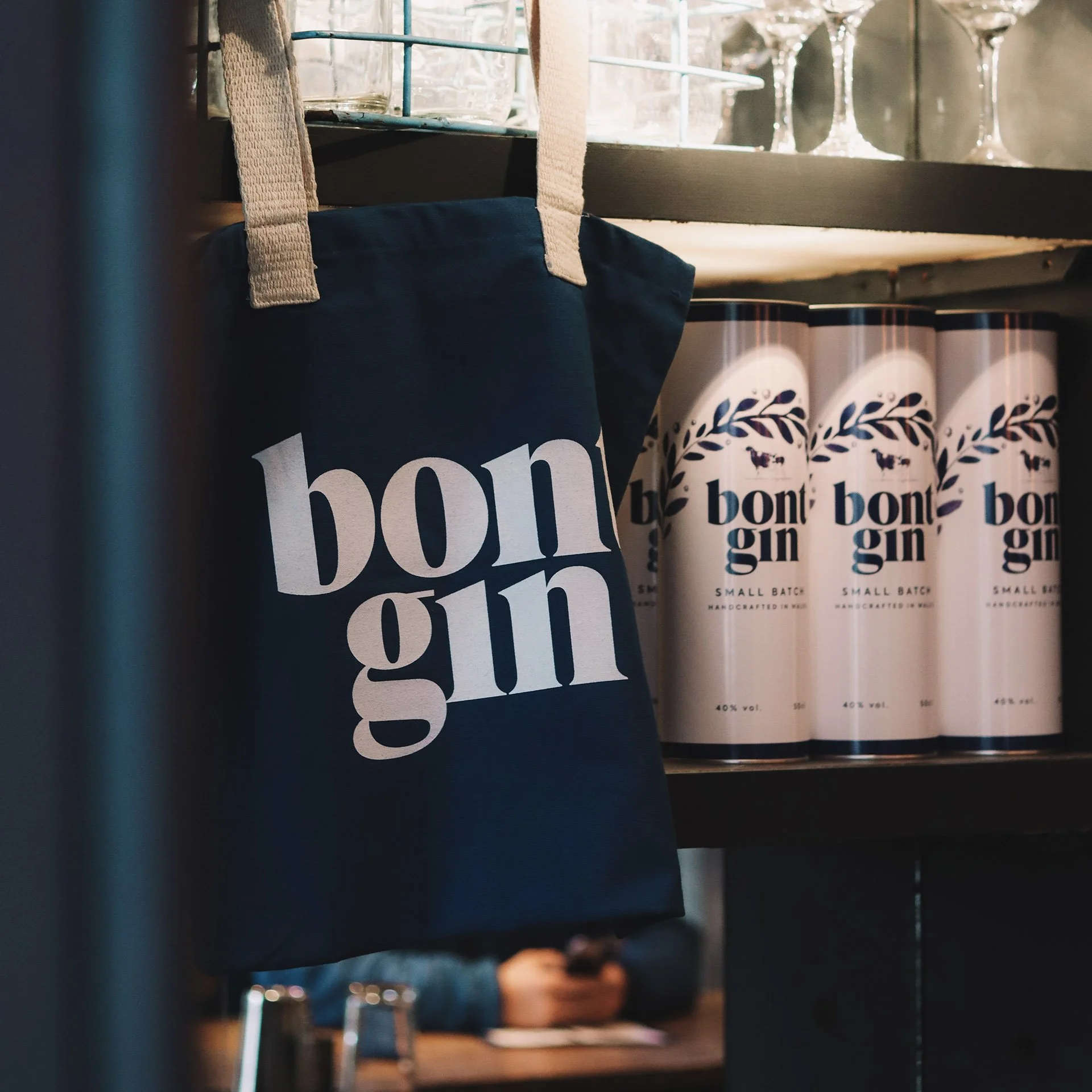
Bont’s tie to Bridgend begins with a family connection to Bridgend Creamery, and was one of the main sources of inspiration for the packaging design. The milky-white ceramic bottle, blue print and cow are a tribute to the creamery and the adverts and posters used throughout its existence.
Bont’s other geographical tie, Cowbridge, is where you can find the Bont Gin bar. The cow, and juniper bridge it sits below, work together as a visual cue for ‘Cowbridge’.


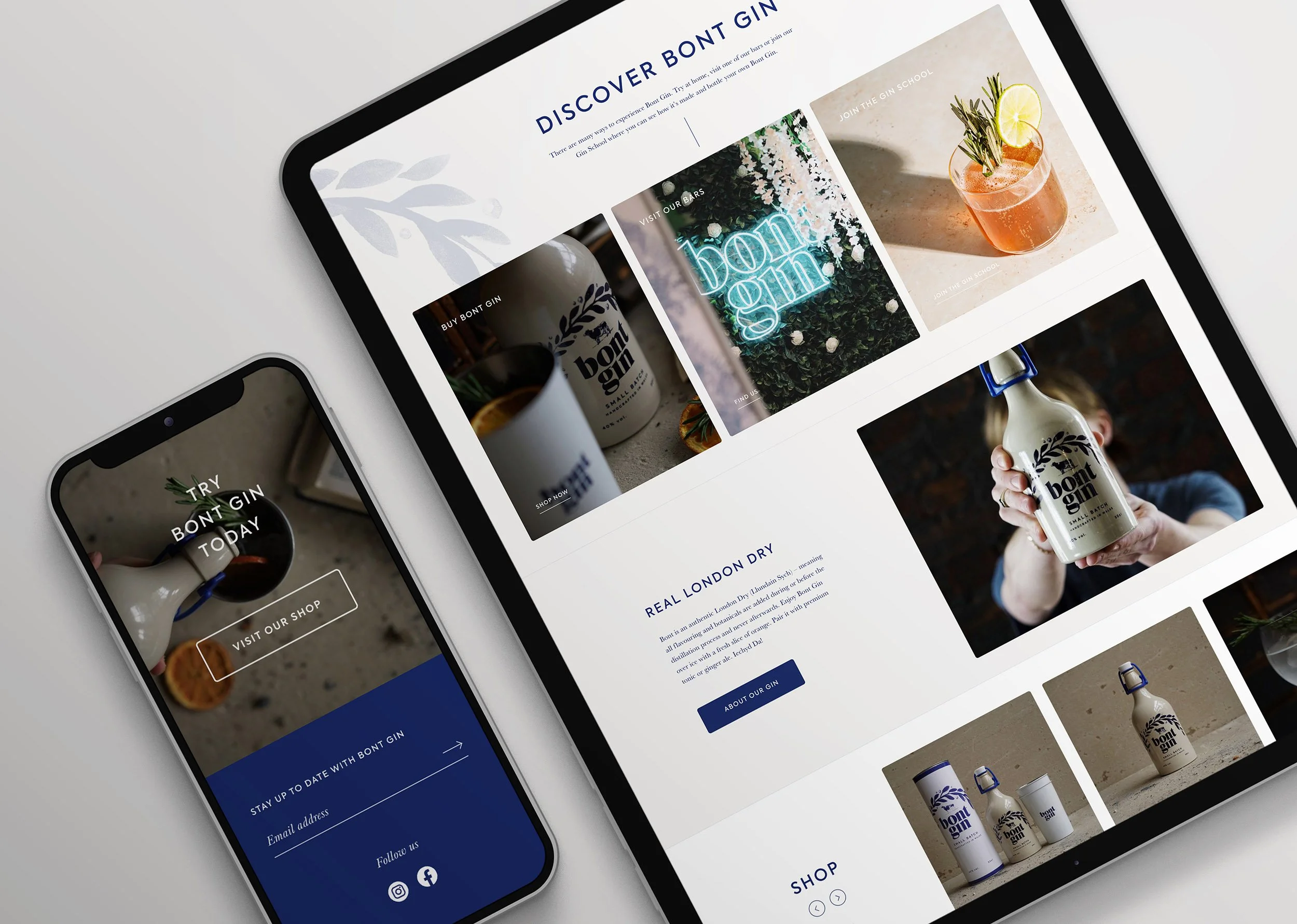
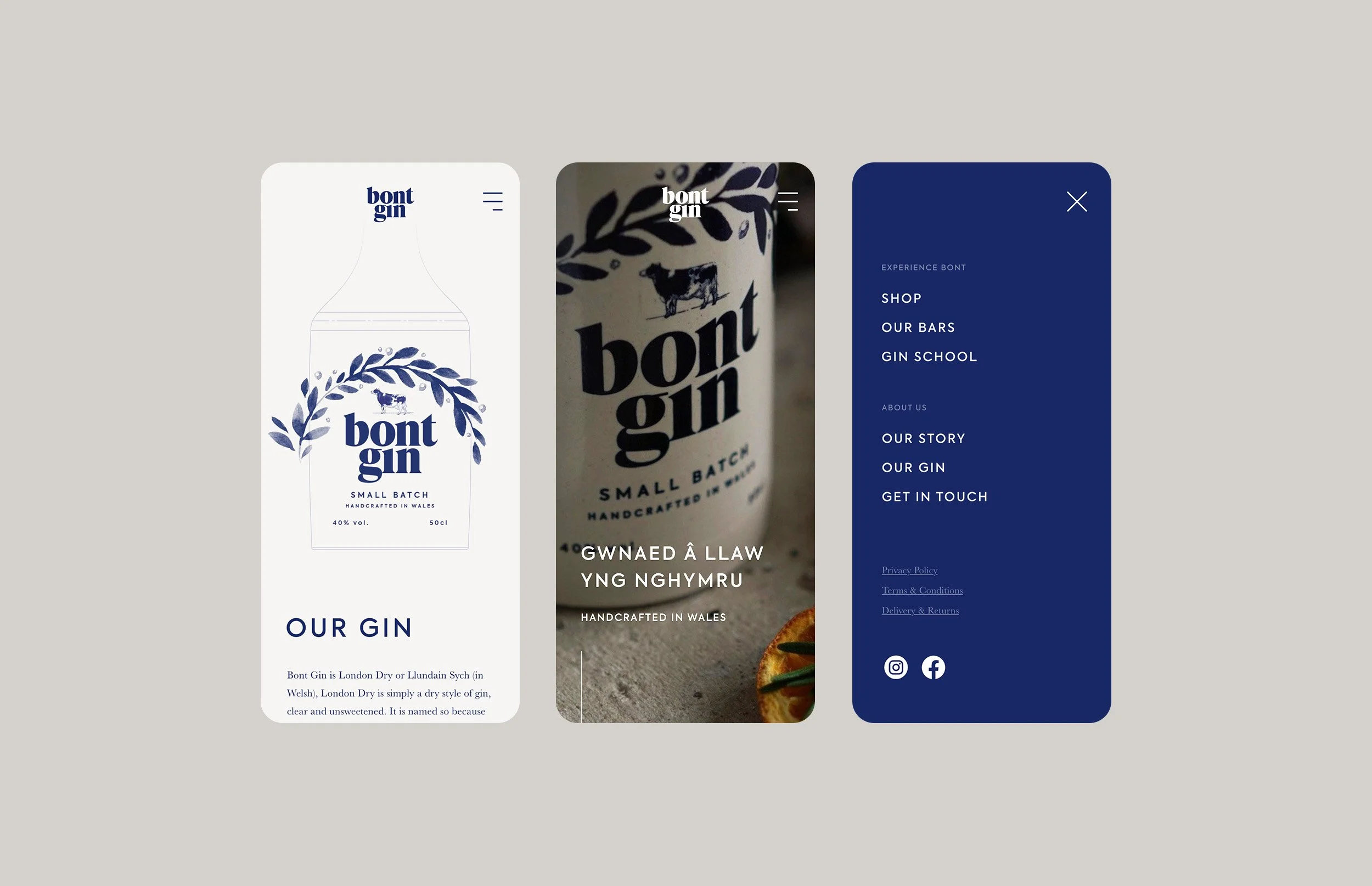
Bont’s digital presence was established via an engaging and easy to navigate website, which showcases the brand, their story and an e-commerce platform.


Year
2020
Services
Logo Design
Packaging
Website
Agency
James Matthews
Photography
Studio Loop
Website Development
Strobe
Up Next
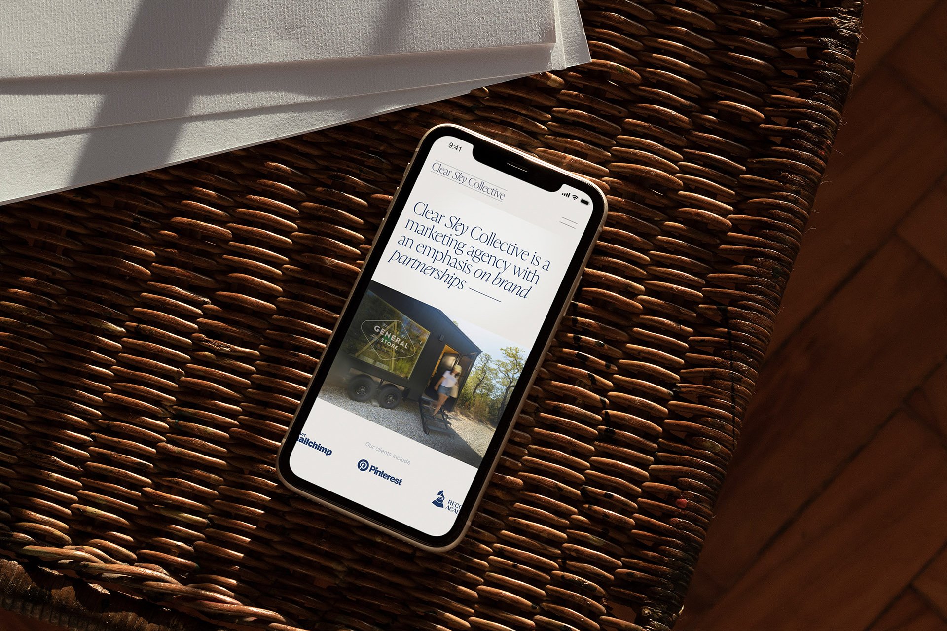
Clear Sky Collective ↘